Top 10 Power BI Dashboard Examples 2023
What Is Power BI?
This is the latest BI (Business Intelligence) software/tool developed by Microsoft to enable you to analyze data present in various source materials. You can create or build reports, analytics and dashboards based on Power BI which acts both as a stand-alone desktop application and a cloud-based service.
Thank you for reading this post, don't forget to subscribe!Power BI software helps you to develop and embed Power BI analytical abilities into custom web applications, data visualization, enhancement of real-time BI capability, perfect integration of fragmented jobs, information processing and seamless integration of most of the enterprise Microsoft offerings.
This technology-driven software helps you to find the answer to an actionable business strategy based on facts, inputs and figures. The business managers and executives in a corporate company or organization use Power BI for day-to-day business solutions related to customer relations, sales optimization and other related jobs.
[Read More: What Are The Advantages Of Oracle EBS Upgrade?]
What are the Power BI Dashboard Examples?
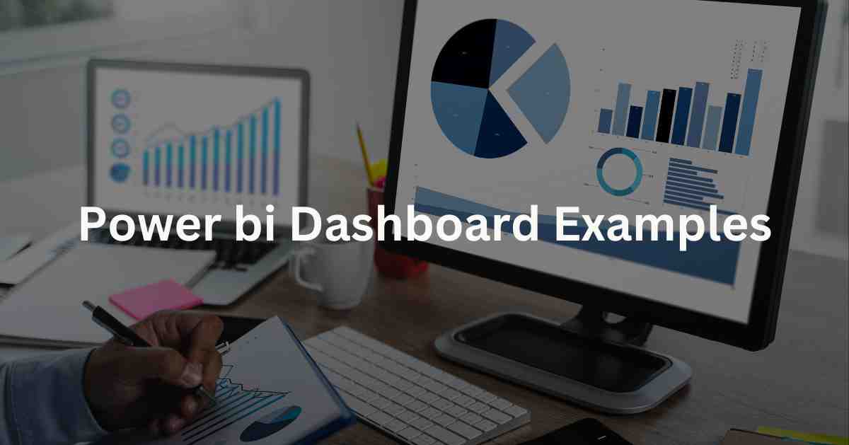
Power BI Dashboard Examples are a collection of visualizations of different kinds. The specialty of the dashboard is that it keeps on updating whenever there is a change in data or new inputs. This facilitates you to know the latest situation on a variety of issues related to a corporate company.
The dashboard is very useful for the following points:
- Allows you (as a user) to drag and drop fields directly into the canvas.
- Helps you to select the right visualization.
- It offers different modes of real-time visualization like Charts, Graphs, Statistics, Cards, Tables, Maps and Geographical Plots.
- Data analysis through visualization.
- Create a Realistic Report based on visualization.
The examples of the BI Dashboard are given below:
Sales Scorecard Dashboard
This is primarily meant for the top or decision-making Senior Management of a corporate company to make a comparative study of sales figures of a given period: for example, it can be the current fiscal year compared to the sales performance of the previous financial year. You can easily understand the difference between the two years based on the inputs or data of sales figures between the two fiscal years.
Customer Segmentation Dashboard
This dashboard is extremely useful for B2B (Business-to-Business) companies or organizations. It shows turnover in sales in a given period, customer-centric earning and profitability. The data and its management give you a clear-cut perception of which customer is most important to you. You can also get to understand the importance of each customer that you have.
Daily Sales Flash Dashboard
The sales of your business platform fluctuate on a day-to-day basis. This dashboard acts as the real-time daily Sales Scorecard Dashboard. You get the figures of sales related to different regions and also different retailers who sold your products. You can also understand the regional importance of your consumer goods, different products and services. You can understand this by analyzing the data.
Email Engagement Analytics Dashboard
This particular dashboard is very important for those sales platforms and companies that carry out a large chunk of their businesses through mass email marketing methods. With the help of this dashboard, you get figures or data on the successful delivery of emails, check whether your company’s mail has been opened and seen or not and replies you get. Your company can act upon the orders received through email.
[Read More: 12 Best Free Virtual Machine Software in 2022]
Product Sales Dashboard
It helps your company to get a clear picture of the sales scenario and also enables you to draw future sales promotion campaigns and strategies based on the inputs you have received. This dashboard tells you about the individual sales figure of individual goods or services. This can help you in sales analysis. This dashboard is very useful for those engaged in E-Commerce and online sales.
Marketing Campaign Insights Dashboard
To carry out a product-based or service-based marketing campaign, you need facts, figures and data. Such figures, charts and graphs give you an exact insight on how to carry out the campaign and for which products. This dashboard can enable you to know how your competitors carried out their campaigns and what results they got out of it. Thus, it can be a major decision-making tool for you in your marketing campaigns.
Ad Display Campaign Dashboard
Advertisement is a major way to promote your product or service, create customer loyalty and chisel your brand image. For this, you require to formulate a realistic strategy. You can compare your advertisement campaign slogans or visuals with those of your competitors. You can understand which particular ad campaign of a company engaged in a similar nature of business scored high in the market. Such a data structure can act as market ad campaign feedback for you.
Income Statement
This dashboard gives you a broad view of your income from sales in a given period. You can easily conclude how much you earned after meeting all the liabilities like rent, conveyance, commission to traders, salary and sundry other expenses. You get statistics of these expenses and incoming sales revenues on individual heads (i.e. specific products etc.,). This will be extremely useful for your taxation matters. You can know both profits before tax and profits after tax or net income.
Financial Analytics Dashboard
You need to meticulously analyze revenue spent and revenue accrued in your business. This dashboard will be useful for you as you can easily analyze the financial position of your company and also get a clear picture of the PL (Profit-Loss) scenario. You can analyze which way the profit scenario is going or which way the loss scenario is moving. You understand the PL better and adopt corrective measures if you feel your company may run at a loss in a given financial year.
Finance Dashboard
This helps you to get major indications about the financial position of your company in a given time period. You know the company’s incoming revenue, expenses, expected profit, Earnings before tax, Earning After Tax, Inventories, Securities, corporate debt scenario and Accounts Payables. You can fragmentize them all and know the financial position of the company in its totality.
[Read More: Must-have Features in Attendance Management Software]
Conclusion
Power BI and its Dashboard have come as a major revolution in the simplification of almost all aspects of a corporate company or an organization. This software is versatile and performs all vital analytical jobs that your company needs for its growth. It has simplified many complex tasks of a corporate company. Besides, the functional process of Power BI and its Dashboard is very fast. Thus, you can make the right decision in a very short time. Let us know if you want to know more.